
Why your user research might be telling you what you want to hear
Five blind spots that turn well-intentioned research into confirmation machines.
A VP at a well-known global enterprise sent me a question recently.
“From a researcher’s perspective, what user details do dev and product teams overlook most easily?”
I didn’t reply right away.
Not because I didn’t have an answer. But because the question kept expanding the more I sat with it.
This is what came out after a few days of thinking.
There’s no clean list.
That was my first honest reaction.
Because the way users behave is shaped by everything they’ve experienced before. And so is the way researchers see.
We all carry filters. Built from past projects, past successes, past assumptions that turned out to be right — and ones that didn’t.
Blind spots aren’t random. They’re personal.
But some patterns show up everywhere.
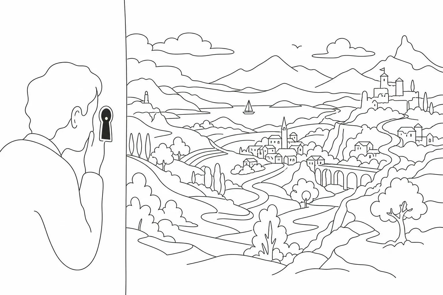
1. Tunnel vision — seeing the dot, missing the picture
A single metric. A single complaint. One very vocal stakeholder.
Once a team forms a belief, everything that follows gets filtered through it. Quietly. Automatically.
The loudest voice in the room is rarely the most representative one. But it’s almost always the most memorable.
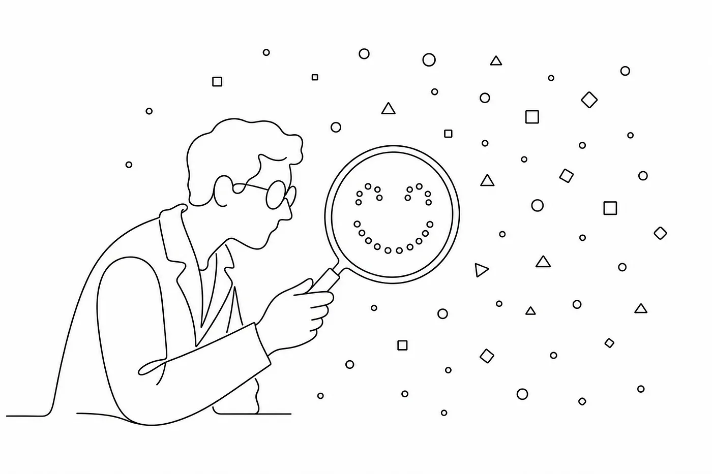
2. There’s a difference between testing a hypothesis and confirming one.
Good research needs a hypothesis. Without one, you can’t evaluate what your findings mean — or decide how to use them.
But there’s a line.
Testing a hypothesis means you’re open to being wrong. Confirming one means you’ve already decided you’re right.
The uncomfortable part?
The more experienced you are, the easier it is to cross that line without noticing.
“I already know this” — every time I hear those words in a research briefing, I pay closer attention.
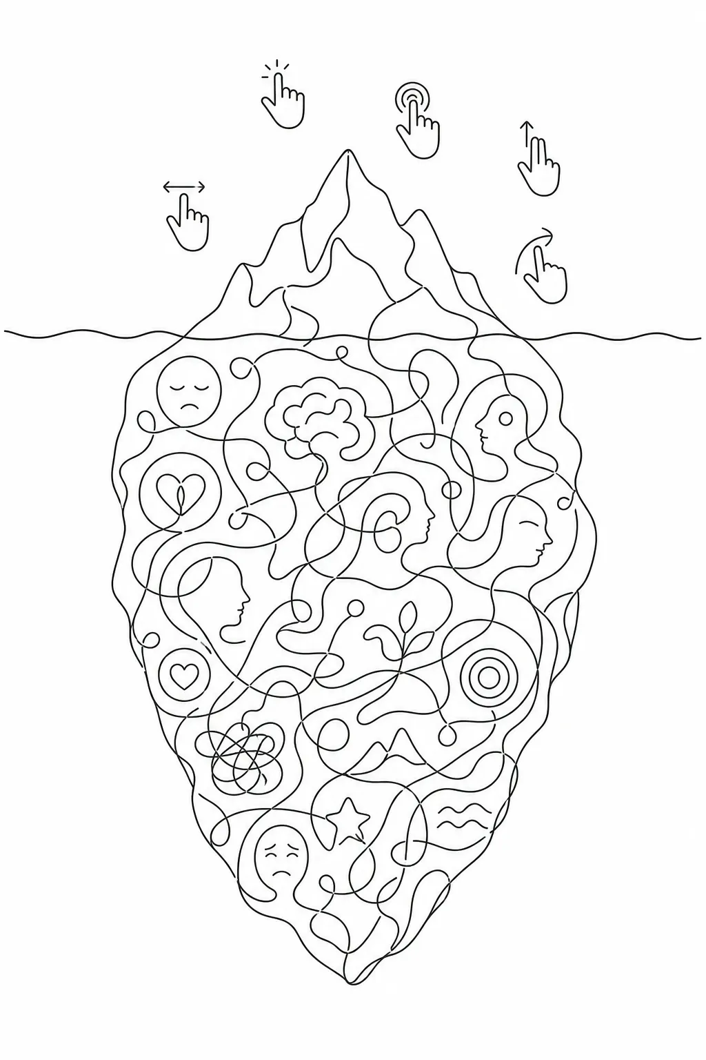
3. The visible layer is not the whole story.
Teams get good at collecting what’s on the surface.
What users do. What users say.
But behaviour is a result, not a cause. And stated opinions are often post-rationalisations of something deeper.
The real insight is usually one layer further down. Most research stops before it gets there.
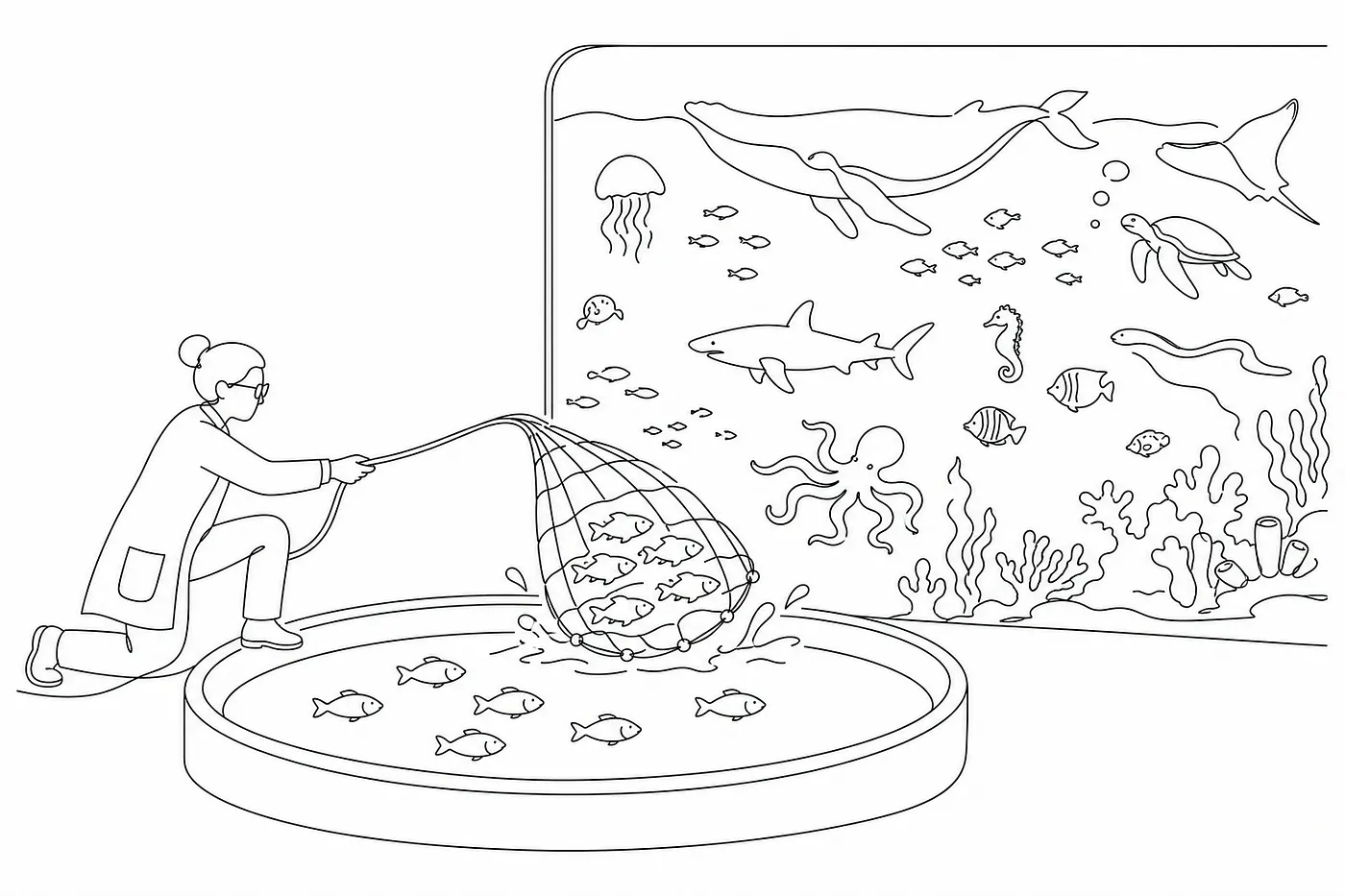
4. Convenience samples can only confirm what you already know.
The participants who are easiest to recruit will tell you the most familiar things.
Every user carries a different set of experiences. That diversity isn’t noise in your data. It’s the signal.
And here’s the part of this that I think the industry quietly avoids talking about:
Usability testing — the method we rely on most to validate interface design — is often one of the least reliable indicators of whether a design is actually good.
Bad design trains users over time. They adapt. They find workarounds. They stop noticing the friction.
By the time you test it, it passes.
We mistake learned tolerance for good design. And then the cycle continues — slightly more invisible than before.
This isn’t an edge case. It’s the norm in digital design.
This isn’t a new observation — Nielsen Norman Group has documented similar patterns — but it remains one of the most consistently ignored ones.
5. Research findings are not universal.
Every finding has a context and a boundary.
Applying insights beyond the situation they came from — across different products, markets, audiences — is where well-intentioned research quietly becomes internal misinformation.
It doesn’t announce itself. It just slowly shapes decisions in the wrong direction.
Knowing the blind spots is only half of it.
The other half is research design.
Do you know exactly what question you’re trying to answer? Are your research questions built from that purpose — or from what’s convenient to ask? Does the structure of your study allow for answers you didn’t expect?
A poorly designed study doesn’t just produce weak findings.
It produces confident, well-presented, consistently biased findings — all the way from how data is collected, to how it’s analysed, to how it’s reported.
That’s harder to recover from than doing no research at all.
And then there’s one more layer.
Knowing how to use what your findings show. And staying honest about what they don’t.
The boundary of your data is just as important as the data itself.
Most research reports are very good at telling you what was found. Very few are clear about what the research was never designed to see.
I’ve been reminding myself of this for over twenty years.
And honestly?
The more experienced I become, the easier it is to forget.
Experience makes us faster. It also makes us more likely to only see what we were already prepared to see.
There’s no such thing as perfect research.
But being aware of where you might be looking wrong — I think that’s the line between research that genuinely helps and research that just feels like it does.